Complete redesign of the visual experience of the Minha Vida portal in 2014, focused on making it responsive and creating a coherent system of colors, typography and cards by editorial section.
Client
Year
UI Design
Web
Responsive
In 2014, upon joining the Minha Vida portal, I received the main mission of redesigning the entire visual experience of the site, which until then worked on desktop only, and making its adaptation to mobile viable.

Problem
The existing layout was not responsive, the pastel color palette no longer followed the visual trends of the moment, and the site lacked a typographic system with a clear hierarchy between headlines and paragraphs, harming legibility, especially on smaller screens.
Solution
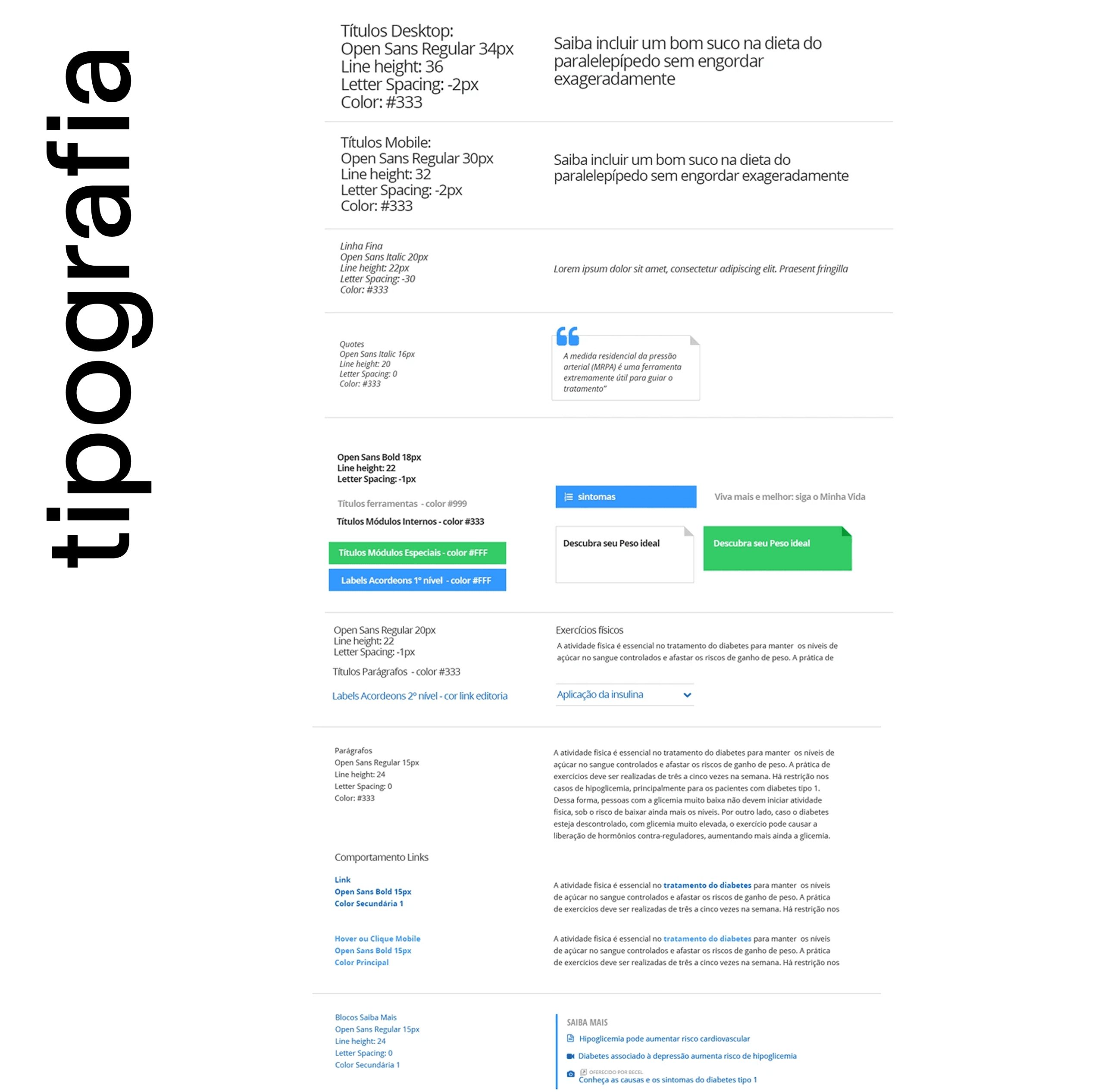
Typographic system with a defined hierarchy of headlines and paragraphs (with weights and variations specific to mobile), a new palette of vibrant, web safe colors (one per channel, keeping the previous logic with occasional adjustments), a language of cards and flags to organize texts, calculators, comments and related content with visual coherence across the site, and a random image banner on the home, drawing one photo per channel on each load.
Process
I started with a typographic study (hierarchy, weights, variations and legibility on mobile), moved on to adapting the color palette by channel, structured the card language that organizes content consistently, and solved the home image challenge with randomization by channel.
Result
A consistent visual system applied across all the portal's platforms, with guides that gave the development and marketing teams autonomy to produce pieces within the standard.